Web3 Wallet Dashboard Reimagined
The world of Web3 remains a challenge for many, mostly because of its complex jargons and technicalities. While wallets like MetaMask, Phantom, and Keplr offer robust features, they may fall short in attracting a broader audience or empowering current users with complete clarity and information.
This project seeks to reimagine a key component—the wallet dashboard—by addressing critical issues of transparency and usability.
While attracting a broader audience involves redesigning various aspects of a wallet - here I have focused on the Wallet dashboard as a start since this highlights user's assets' performance and is an important space for transparency and trust.
My Role
Researcher, Product Designer
Visual Designer
Design Team
Poornima Parvathy
Duration
2 weeks

Problem
Web3 adoption is slowed by its complex nature and technical barriers, making it intimidating for new users.
The wallet dashboard is a reflection of how your assets are performing and the current wallets don't offer complete information due to which a lot of them have to depend on third party read-only portfolios like Debank.
New users struggle with understanding transactions, tracking assets, and trusting the system due to insufficient transparency.
User Research
I conducted a 2 day workshop - Brainstorming and discussing with people who are users and work in the field of Web3, Blockchain and Cryptocurrency - followed by Card sorting to come up with the Information Architecture.
My research encompassed -
-
Understanding how Web3 wallets are used, types of wallets and the features of it
-
How important are portfolio dashboards and how it shapes the investment decisions
-
Most important KPIs/ features of dashboards in each wallet/ third party apps that they use
-
Comparative study of wallet dashboards

Img: Picture from the workshop to understand the existing features and pain points of Wallet dashboards.
Qualitative Interviews
User research was quintessential. I did the qualitative interviews, complemented by usability testing and contextual inquiries, with current Web3 wallet dashboards and third party dashboard, focusing on pain points, usability challenges, and expectations. By gathering insights from both new and experienced users, I could uncover key areas for improvement in wallet dashboards.

Comparative Analysis
I did a comparative analysis of the existing dashboards and gathered insights from the user interviews as well.
.png)
Key Insights
Based on the research data, I could categorize the insights into 4 categories. This helped me build my solution


Conceptualization
From the insights of User research, I could sketch out wireframes and user flows before proceeding to the final prototype. These wireframes were discussed and analysed in detail with a couple of users to understand the effectiveness.


Solution
Prism is a next-generation web3 wallet designed to overcome the limitations of existing wallets by unifying DeFi protocols, token values, and multi-chain visibility under one intuitive platform. With a focus on clarity and actionable insights, it empowers users to seamlessly manage their digital assets with precision. Catering to both beginners and experienced users, Prism also includes integrated guides and tutorials, making the decentralized world more accessible while ensuring a comprehensive and transparent asset management experience.
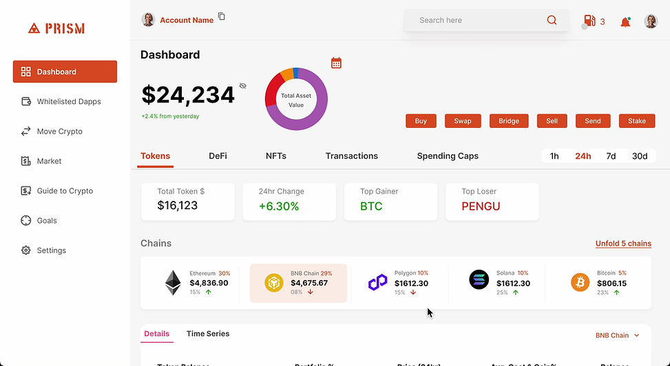

Intuitive Overview
This is an overview of all the assets the users hold:
1. It shows a numerical and visual representation of total assests (Tokens + Defi Protocols + NFTs) with a feature to check snapshot of a particular date.
2. There can be multiple wallets connected to a single account.
3. The page has a timeline filter of 1hr, 24h, 7d, 30d
4. Avg. Cost & Gain % shows how a token has performed overall, to highlight what action item to take.
5. Tabs to clearly demarcate the assets.
6. Chain wise information.
7. A Time series sub tab to see how the tokens have performed over time.

Separate Tab for DeFi
The dedicated "DeFi Assets" tab provides a clear overview of all DeFi protocols users have invested in, categorized with tags like "Staked" and "Lending." It displays the total value of investments, detailed protocol-specific information, and earned rewards, offering a comprehensive view of DeFi activity in one convenient section.

Whitelisted Dapps
The "Whitelisted DApps" section serves as a curated hub for both new and experienced users to explore and invest in trusted decentralized applications with confidence. With a clear and prominent CTA button, users can take immediate action, making it easier to engage with reliable DApps seamlessly and securely.

Guide to Crypto
The guide is an A-Z dictionary with a searchable index that demystifies crypto terminology, helping new users overcome the fear of ambiguity. Featuring beginner-friendly tutorials, it provides step-by-step guidance, while the latest news ensures users stay informed about trends and updates, making their journey into crypto seamless and confident.
Usability Testing & Results
I tested the Lo-Fi wireframes - concept sketches at multiple stages with users for their feedback of content, navigation and functionality and proceeded to conduct tests with the final prototyped screens.
-
Task-Based Usability Test - Based on few screens that have been designed, I tested out success rate of certain tasks.
-
Check the total assets value
-
Check the Tokens and DeFi Assets value separately
-
Find details about a specific DeFi protocol (Eg., staked assets)
-
First Click Test - I did this test to assess if users can intuitively find the right starting point for specific actions. (Eg., Where would you click to view your DeFi rewards?)
-
System Usability Scale (SUS) : I gathered overall dashboard's usability feedback with standard survey questions to the users. (Scale 1-100)
-
"I feel confident and trusted using the dashboard"
-
"The values are clear"
-
"Features are easily findable"
94%
Avg. Task completion Rate
90%
Correct first click.
<5 seconds for straightforward action
~85+
SUS Score. Good Usability.
Future
Challenges
Multi-Chain Integration Feasibility: Seamlessly integrating and maintaining compatibility with multiple blockchains and protocols can be technically challenging.
Future Potential
-
Expanded DeFi Integration: Prism could evolve to include advanced DeFi tools like yield optimization, governance participation, and NFT management, broadening its utility.
-
Educational Ecosystem: The "Help Guide to Crypto" could expand into a complete educational platform with interactive learning, quizzes, and certifications, becoming a gateway for new users into the crypto space.
-
AI-Powered Insights: Integrating AI to provide predictive analytics, risk assessment, and personalized recommendations for portfolio optimization.